
How to Design a Website Feedback Survey
Design a short website feedback survey with the right trigger, clear questions, and a plan to act on responses.

A website feedback survey works best when it asks about the task a visitor is doing now. A generic “How do you like our website?” popup can produce vague opinions and interrupt the very task you want to improve.
Choose the trigger before writing the question
A help-page survey is useful after the visitor has had a chance to read and try the instructions. A pricing-page prompt may be useful after meaningful engagement, not on the first second of loading. A signup feedback request may fit after a failed attempt or at the end of a step. Write the trigger in the research brief: page, event, delay, eligibility, frequency cap, and dismissal behavior.
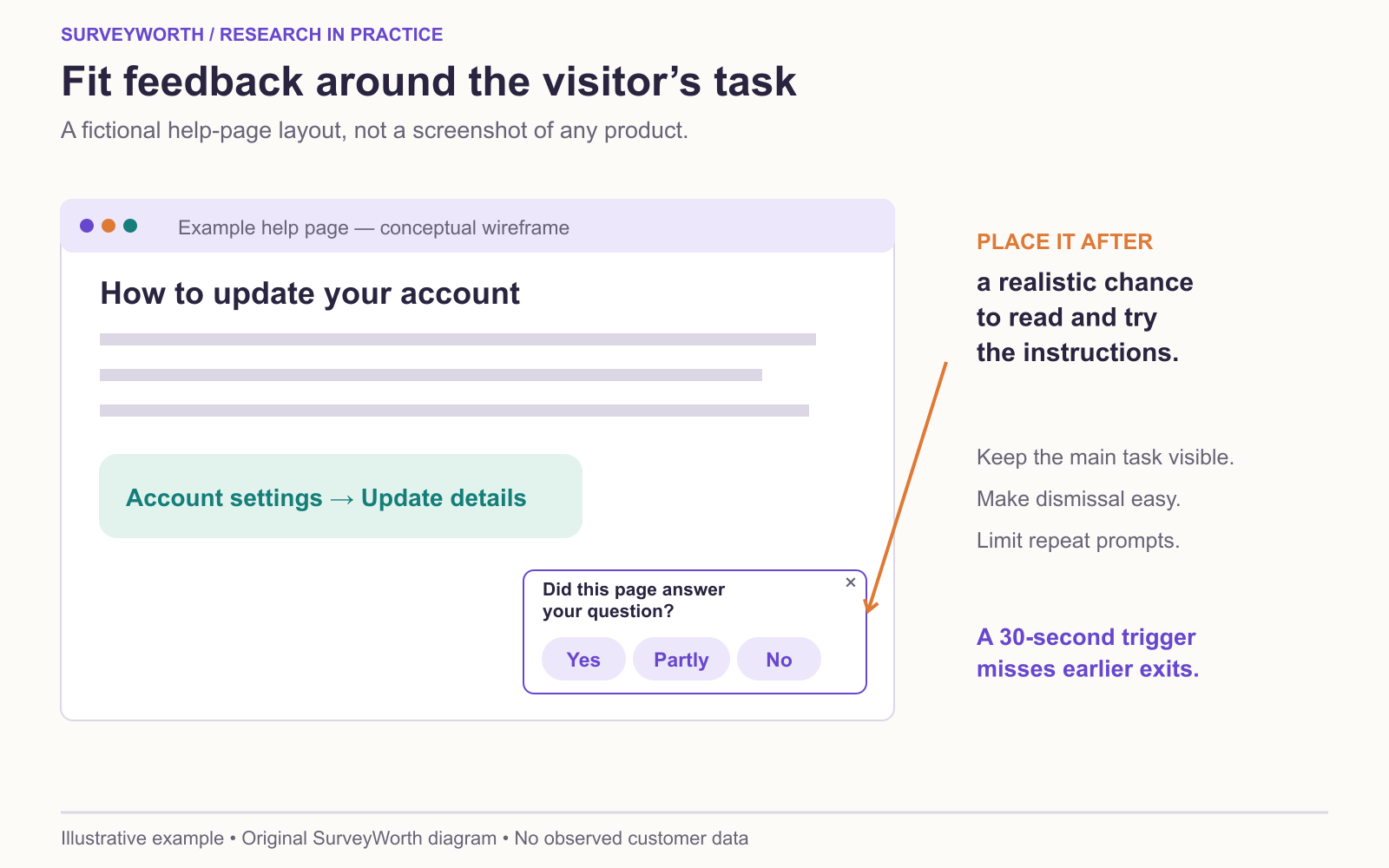
Image source: SurveyWorth original conceptual diagram, 2026. Based on “Choose the trigger before writing the question” in this guide. Illustrative example; no observed survey data or official product screenshot.
This matters because the trigger shapes the sample. A prompt shown after 30 seconds excludes people who leave sooner. A prompt shown only after submission describes completers, not people who failed. A feedback tab is less intrusive but relies on self-selection. Document these choices and match the claim to the people who actually had an opportunity to respond.
Ask about the task, not the whole site
For a support article, ask whether it helped the visitor complete the specific task. If the answer is no, ask what was missing. For a pricing page, ask what information is needed before choosing a plan. For an account form, ask which step was confusing. A broad “How do you like our website?” question mixes visual preference, task success, and brand opinion, so it is hard to act on.
Use a short, neutral opening. “Did you find what you needed on this page?” with Yes, Partly, No can work for content. “What were you trying to do?” can help when task intent is unknown. Avoid a leading question such as “How helpful was our improved page?” because it presumes usefulness.
Use context without overcollecting
The page URL, device type, and trigger can make a response far more actionable. Check that the collection and privacy statement accurately describe these fields. Do not store more session information than necessary. If a comment contains an account number or other sensitive detail, have a process to restrict or remove it from reports.
Review feedback by page and task. Ten comments saying “I cannot find the cancel button” on an account page may warrant a usability test and design review. Do not publish a site-wide percentage from an intercept on one page. Compare comments with analytics, search terms, and observed tasks when available.
Close the loop with a small test
After changing a page, test whether visitors can complete the task more easily. A lower number of complaints may simply mean fewer people saw the prompt. Track the trigger rate and response volume alongside the theme. When possible, combine the survey with task-completion evidence. A team can use feedback to locate a problem, but the page change should be judged by whether the problem actually became easier to solve.
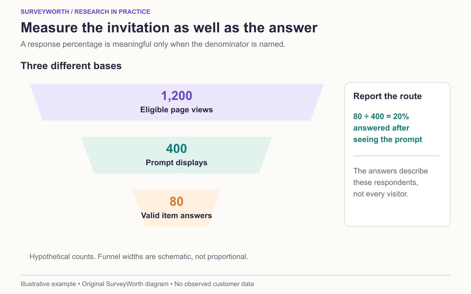
Image source: SurveyWorth original conceptual diagram, 2026. Based on “Measure the prompt as part of the website” in this guide. Illustrative example; no observed survey data or official product screenshot.
Measure the prompt as part of the website
QuestionPro’s intercept-survey overview describes time, scroll, exit, and click triggers; Jotform’s website-question examples show task-focused prompts. A trigger is a sampling rule. If the prompt appears only after 30 seconds, early exits never enter its exposure base. If it appears immediately over the checkout button, it may create the very friction it is supposed to measure.
| Page and event | First item | Exposure log | Owner |
|---|---|---|---|
| Help page after a realistic reading interval | “Did this page answer your question?” | Eligible views, prompt displays, answers | Content |
| Search with no result click | “What were you trying to find?” | Searches, prompt displays, answers | Search |
| Checkout validation failure | “What, if anything, was unclear?” | Errors, prompt displays, answers | Commerce |
Hotjar’s survey-question examples can inform wording, but the decision should follow the actual page task. For each item, report valid answer base separately from prompt exposure and dismissal. Compare task completion with and without the prompt where feasible. Keep page version, trigger, and device in the data under an accurate privacy notice. The question-order guide helps keep the first prompt from priming later feedback.
Compare the site before and after a change cautiously
After rewriting a help article, a lower complaint count may mean fewer readers saw the prompt. Report eligible page views, prompt displays, valid item answers, and the task outcome for each version. Hotjar’s analysis workflow helps connect findings to action; Typeform’s feedback-limits discussion warns against overreading who chose to respond. If the trigger or page traffic changed, say so before claiming improvement. A small usability test can show whether a visitor now finds the answer; the survey-versus-usability guide explains what that observation can establish; a controlled page experiment can provide stronger evidence about the change. Keep the same first question and answer labels while measuring a trend.
A page-level decision record
A useful finding ties the comment to a page and a task. Suppose 24 people answer a help-page prompt and 9 choose “No.” Five of those 9 say they could not find the cancellation instructions. That is a signal to inspect the page, not a finding that 5 of all visitors could not cancel. Record the eligible page views, prompt displays, 24 answers, the exact question, page version, and the route through which visitors arrived. If the help page was changed during fieldwork, split the records by version.
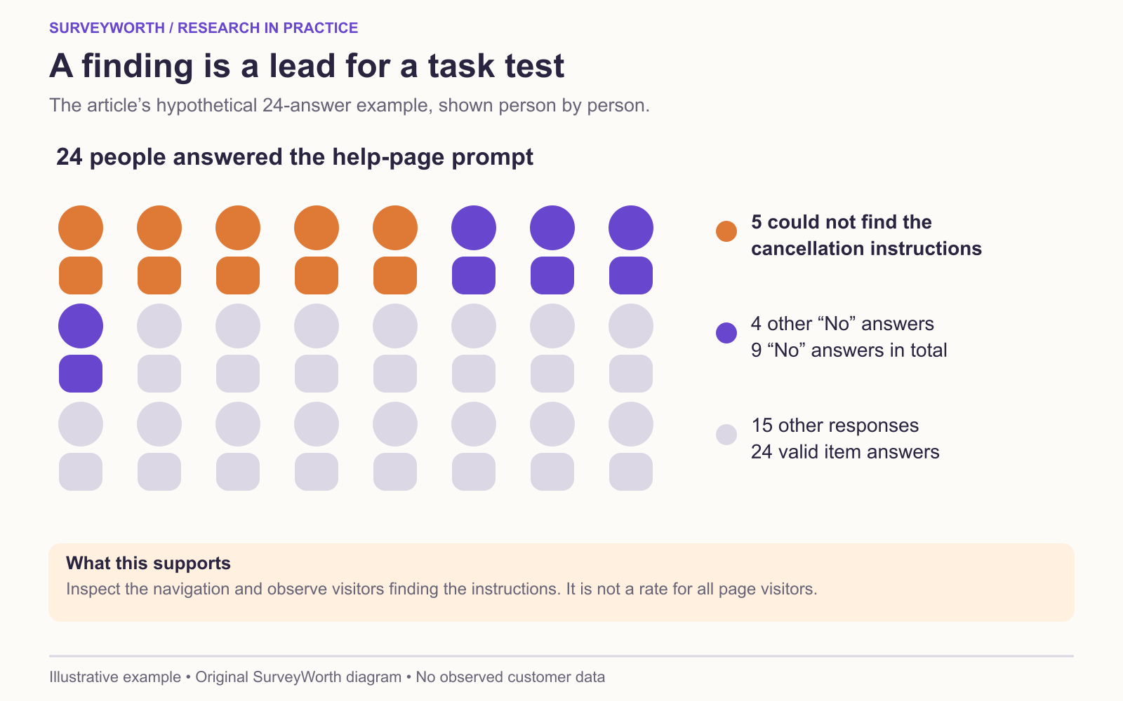
Image source: SurveyWorth original conceptual diagram, 2026. Based on “A page-level decision record” in this guide. Illustrative example; no observed survey data or official product screenshot.
Before rewriting the page, ask a few visitors to locate the cancellation instructions while you observe. The team may discover that the instructions are clear once found but the link label is hard to recognize. That would call for a navigation test rather than a longer article. After the change, compare task completion on the same task, and keep prompt exposure stable if you also compare survey responses. This sequence gives the content owner a specific decision and a way to check whether the edit helped.
Frequently asked questions
Should the survey pop up immediately?
Usually wait until the visitor has had a chance to use the page, unless the purpose is a very specific first-impression study.
How many questions should it have?
Keep the request proportional to the interruption. One focused question plus an optional follow-up is often enough.
Choose tools for your next survey.
Explore survey creation software and research tools for your project.
Explore survey softwareKeep reading.

How to Test a Marketing Campaign With Surveys
Use surveys before, during, and after a campaign to test message clarity and track audience response without overclaiming causality.
Read the guide
How to Measure Brand Awareness With a Survey
Measure unaided recall and aided recognition with balanced survey questions and careful sampling.
Read the guide
How to Design a Product Testing Survey
Write product concept, prototype, and post-launch survey questions that fit what participants have actually experienced.
Read the guide