
How to Design a Mobile-Friendly Survey
Make surveys easier to complete on phones with focused screens, readable choices, short typing tasks, and real-device testing.

A mobile-friendly survey is more than a desktop form squeezed into a narrow column. People answer on phones with limited space, interruptions, and touch controls. Design the question flow for that context from the start.
Replace desktop patterns that fail on a phone
Wide grids compress labels until respondents cannot see the question and response choices together. Split a grid into short, clearly labeled items, or ask only the items that matter. A ranking widget that requires dragging can fail for touch and keyboard users. Consider a “choose your top three” task when exact order is unnecessary. A slider may feel attractive but can be difficult to set precisely; labeled buttons can be clearer.
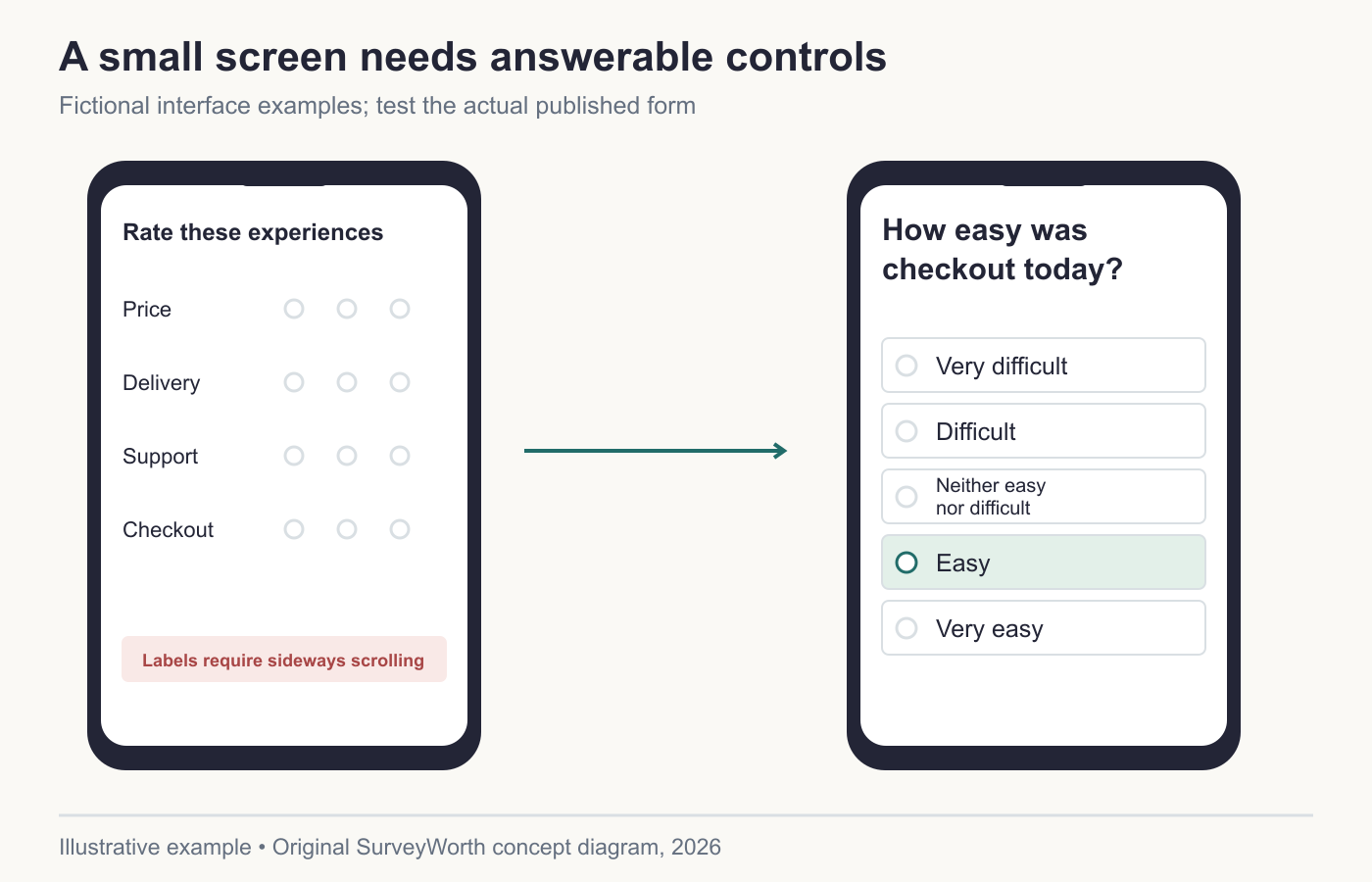
Image source: Original SurveyWorth conceptual diagram, 2026. Illustrative, not observed data or a product screenshot. Based on “Replace desktop patterns that fail on a phone”.
Do not force a respondent to zoom horizontally to read a choice. Test the longest answer label, not only the shortest. Let text wrap cleanly and leave enough space between tap targets. Check color contrast and visible focus states. The respondent should be able to understand which choice is selected without relying only on color.
Design the invitation and landing page as one experience
A mobile survey begins before the first question. An SMS or QR code may open in an in-app browser with limited controls. An email may display a long tracking URL that looks suspicious. The landing page should immediately confirm who is asking, why, the expected time, and whether the survey is optional. Avoid a heavy splash page or a forced account login unless identity is essential and disclosed.
If the survey is intended to be anonymous, check that unique invitation links or embedded identifiers do not contradict the promise. If you need to prevent repeat submissions, explain the tradeoff and choose a method that fits the privacy design.
Test the phone form as a task
QuestionPro’s mobile-design guide advises against wide matrices, heavy typing, and cramped controls; Typeform’s design review adds branching and pilot checks. Turn those recommendations into a test script: open the invitation on a small iPhone and Android device, complete the shortest and longest legitimate routes, increase text size, rotate the device, interrupt the session, and inspect the exported answers. Record which device and browser produced each failure rather than writing “mobile tested.”
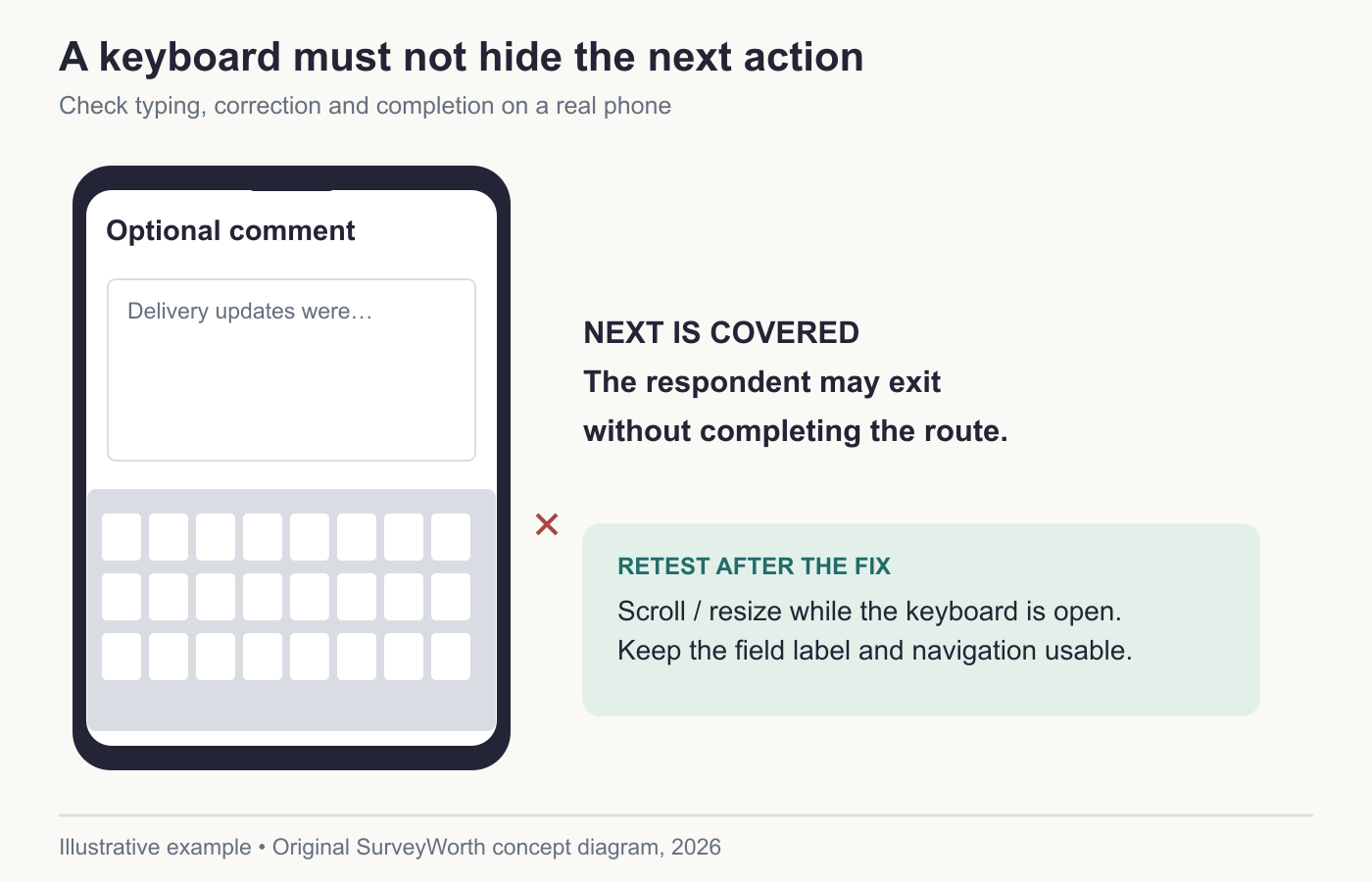
Image source: Original SurveyWorth conceptual diagram, 2026. Illustrative, not observed data or a product screenshot. Based on “Test the phone form as a task”.
| Failure observed | Likely data effect | Fix to retest |
|---|---|---|
| Scale labels disappear after scrolling. | People choose a number without its meaning. | Use stacked labeled choices. |
| Keyboard hides the Next button. | Long-text users abandon the form. | Keep navigation visible. |
| A matrix is reduced to different questions. | The construct changes. | Start a new trend or report versions separately. |
Involve.me’s satisfaction-survey article discusses mobile-friendly short forms, but shortening should follow the research decision. Deleting two dimensions from a five-item matrix is a change in what was measured, not merely a layout fix. The question-format guide helps choose an equivalent mobile answer format where comparability matters.
Treat accessibility defects as coverage defects
A required grid that cannot be used with keyboard navigation excludes some eligible people before analysis even begins. W3C’s forms tutorial covers labels, instructions, and errors; Voxco’s inclusive-questionnaire discussion links questionnaire choices to who can participate. Test large text, screen reader labels, focus order, and error recovery on the actual published form. Log the device and assistive setup used for each issue. A post-launch fix changes the measurement environment, so mark the release and inspect whether skip patterns changed. The pilot procedure can capture these checks before the public invitation.
Use mobile context in analysis
Compare completion and item nonresponse by device when device data are collected appropriately. If phone respondents skip a long open question more often, that may reflect typing burden rather than lack of opinion. If a scale behaves differently across screen sizes, pause trend interpretation until the UI is fixed. Designing for phones improves coverage only if the invitation reaches the right people and the form remains understandable.
Replace a desktop matrix with answerable phone items
A five-row matrix asking respondents to rate price, delivery, support, checkout, and product quality on one screen may require horizontal scrolling and make scale labels disappear. For a phone-first survey, ask only the dimensions tied to the decision, on separate screens or compact cards:
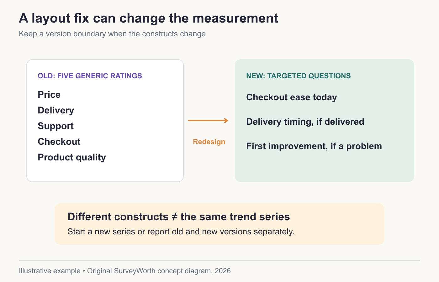
Image source: Original SurveyWorth conceptual diagram, 2026. Illustrative, not observed data or a product screenshot. Based on “Replace a desktop matrix with answerable phone items”.
- “How easy was it to complete checkout today?” — Very difficult / Difficult / Neither / Easy / Very easy.
- If a delivery occurred: “Was your order delivered when expected?” — Earlier / On time / Later / Not sure.
- If a problem was reported: “Which part should we improve first?” — Checkout / Delivery / Support / Something else.
This is not a claim that one question per page is always best. Three targeted items replace five generic ratings, so the survey now measures a different set of constructs. Start a new series or report the old and new results separately; do not present their percentages as a continuous trend. Test the shortest and longest branch on a small phone, with screen reader and keyboard navigation where relevant. Check that the label stays visible when a choice is made and that the export retains the same category meaning across devices.
Frequently asked questions
Should mobile surveys have fewer questions?
Often they should have less effort, but count alone is not the issue. Remove dense tasks and test actual time.
Is one question per page always best?
No. It can increase taps and loading. Group short related items when they remain easy to understand.
Can mobile and desktop answers be pooled?
Only after checking that the same construct, wording, options, and eligibility were used, and after inspecting device-specific missingness.
Choose tools for your next survey.
Explore survey creation software and research tools for your project.
Explore survey softwareKeep reading.

How to Test a Marketing Campaign With Surveys
Use surveys before, during, and after a campaign to test message clarity and track audience response without overclaiming causality.
Read the guide
How to Measure Brand Awareness With a Survey
Measure unaided recall and aided recognition with balanced survey questions and careful sampling.
Read the guide
How to Design a Product Testing Survey
Write product concept, prototype, and post-launch survey questions that fit what participants have actually experienced.
Read the guide